What was the client’s brief for the kitchen?
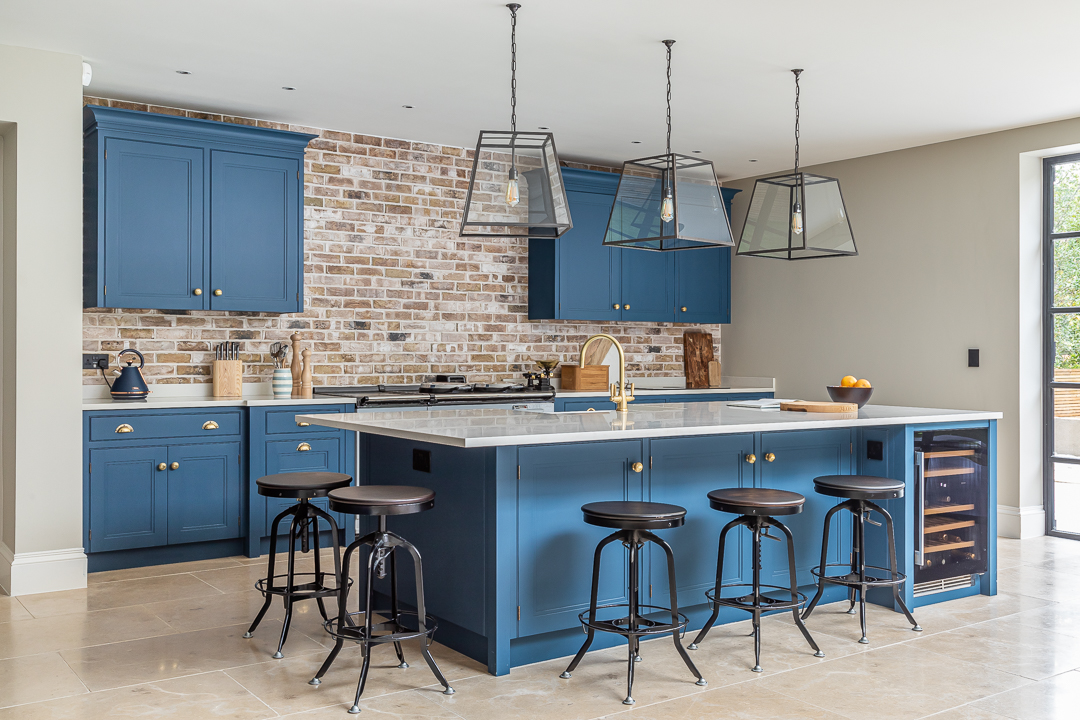
Our clients had an enormous space in their new house that they wanted to make into the life and soul of daily living. They were very keen to have a kitchen that felt spacious but not precious. They wanted it to have a strong, robust but homely feel, and above all they needed it to be easy to work in and to keep clean as they were expecting their first child within 6 months of us winning the project.
They wanted to include some dark timber, and they also wanted a larder unit, large enough to house all their pantry items.
How did you plan the layout?
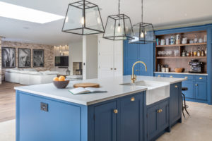
This was a large room. We looked at the middle, not the edges, and thought about how we could create a journey round it, which left enough space for the kitchen to feel calm, uncluttered and free, but which occupied enough of the room to break the space up and avoid it feeling vacuous or empty.
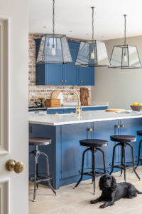
Our clients wanted to have a lot of seating around a central island, so they could entertain in the kitchen while they were cooking. We put a full overhang on one end and a ¾ overhang on the other.
They wanted an Aga, which we helped them source and we positioned this before we designed the rest of the units around it
What inspired your overall design?
My clients had a pretty good idea of what they wanted and had even begun to think through the layout, and they were great at articulating what they had in mind, in terms of both look and feel. This made our job of helping them choose shapes, styling, colour and textures much easier. There were only a couple of areas where there was some debate, and the choice of kitchen handles went back and forth once or twice, but the really great thing about the finished room was that it was absolutely as both they and we had imagined it.
Were there any obstacles you had to overcome? If so, how did you do this?
The size of the room was the main challenge – its scale can easily lead to too much furniture. We were careful to make sure we only included what was necessary for the smooth running of the kitchen and to create a comfortable and enjoyable space for the expanding family. To avoid the kitchen looking too small, or to be dwarfed by the size of the space we oversized it slightly. This means the space is ‘properly occupied’ by the wall units.
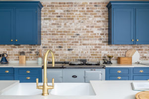
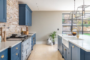
Our clients had a brick wall at the back of the kitchen that they wanted to feature, and we placed two wall units on it, either side of the Aga, that look as though they float. This draws attention to the wall and yet doesn’t detract from it.
What makes this kitchen/house so special?
It’s in a great area of West London and it has masses of light. It’s a house which would have tolerated many different furniture styles. We chose an in-frame, simply detailed, panelled door with an MTD designed projecting wooden moulding, or cock bead, which provides relief and texture. The kitchen was painted Benjamin Moore, Hudson Bay blue, and the life in the colour coupled with the dimensions and relief on the doors and drawer fronts brought the kitchen to life, while remaining sympathetic with the period of the property.
What materials and finishes have been used in the kitchen?
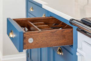
Bespoke in-frame shaker style kitchen with half cock bead and soft close doors. Stained oak drawers. Worktop – 30mm thick Carrara Quartz with 80mm upstand. Aged brass beehive cabinet handles and ages brass period drawer pull handles
What colour is the cabinetry painted in?
Benjamin Moore, Hudson Bay Blue
Visit our portfolio page to see further images and other similar projects

